WYMORE
< Back to Work
Brand Identity
2023
FROM PROBLEM
TO DESIGN
Our Process
As Josh Wymore prepared to step into a new season of influence, his brand needed to reflect the depth and credibility of his work.
-
Formerly known as Wymore Consulting, the organization had grown organically through more than a decade of leadership coaching, workshops, and training. While the impact of the work was clear, the brand identity no longer communicated the level of transformation Wymore was offering—or supported the broader, global audience Josh was beginning to reach. This moment coincided with the upcoming release of Humbler Leadership in February 2023, signaling a shift from one-on-one consulting toward a more expansive platform for executive development. Wymore needed a brand that felt professional, established, and aspirational—one that moved beyond inspiration to signal meaningful, lasting change. The existing visual system lacked cohesion, clarity, and scalability, limiting the brand’s ability to grow and invite others into the work. Marion Design Co. was engaged to help reimagine the brand, ensuring it could confidently support Wymore’s mission while positioning the company for its next chapter of growth.
-
Marion Design Co. began by listening closely to Josh Wymore’s vision for the future of his company and the role the rebrand needed to play in supporting that growth. Through a brand audit and discovery conversations, we clarified Wymore’s core purpose: helping leaders and organizations become more effective by understanding their purpose and intentionally aligning decisions and resources around it. We also identified key perception goals—the brand needed to feel professional, modern, and innovative as it reached a wider audience. With this foundation in place, we developed a logo designed to anchor the identity and clearly communicate Wymore’s mission. Early explorations included visual metaphors such as bridges, keys, and question marks, along with typographic studies that emphasized the “W” and the meaning embedded in “more.” After refining the concepts to a focused set of twelve directions, we collaborated closely with Josh to synthesize the strongest ideas into a final mark. The result was a logo that feels both thoughtful and confident—positioned to support the brand’s evolving voice and long-term growth.
-
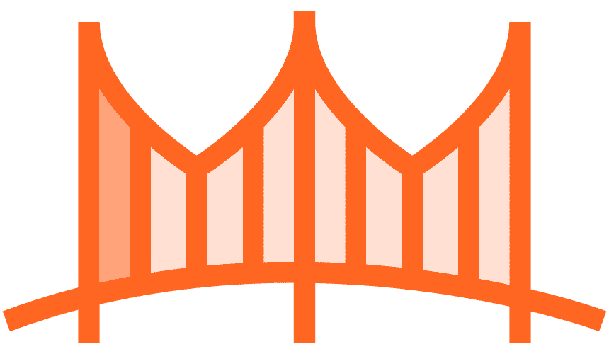
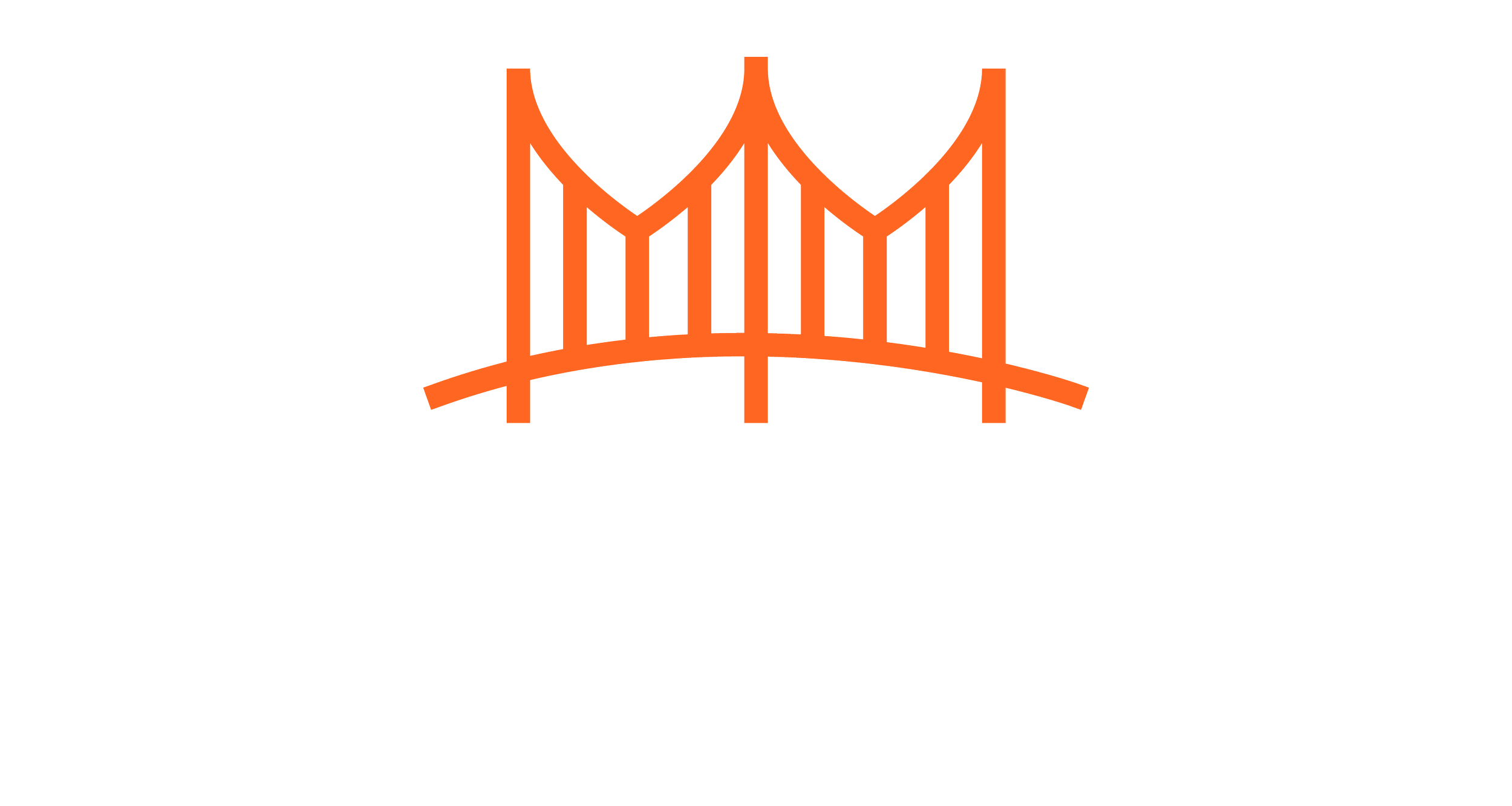
The final identity centers on a logo that combines a suspension bridge with a typographic emphasis on the “more” in Wymore—visually expressing the company’s role in helping leaders move from inspiration to transformation. The mark is layered with meaning: the bridge’s arch subtly forms a “W,” strengthening brand recognition when the icon stands alone, while the vertical lines reference the incremental steps required for meaningful change. The form also carries a quiet resemblance to a crown, reflecting the dignity and confidence found in pursuing one’s potential. Sleek, modern letterforms establish the professional and elite presence Josh Wymore envisioned, with “more” set in extra-bold to reinforce the brand’s mission and tagline. A refined color palette balances maturity and credibility with energy and momentum, anchored by a confident core orange. Supporting typography—Raleway and Open Sans—was selected for clarity, accessibility, and flexibility. Expanded brand guidelines provide room for growth and creative application, and the system was fully implemented across Wymore’s website, aligning the digital experience with the brand’s renewed clarity and purpose.